
Graphic charter vs. visual identity : what's the difference and why it's crucial for your brand ?
In the world of branding, two terms come up again and again : graphic charter and visual identity. Yet many entrepreneurs and marketing professionals still confuse these fundamental concepts. This confusion can be costly for your brand, as it has a direct impact on the consistency of your communications and your customers' perception of your company.
According to a Lucidpress study, companies that maintain visual consistency increase their revenues by an average of 23%. Understanding the difference between a graphic charter and a visual identity is therefore becoming a major strategic challenge for any organisation wishing to develop its brand identity in a professional way.
In this article, we're going to demystify these two concepts, explore their specific features and give you all the keys you need to create effective, consistent visual communication.
What exactly is visual identity ?
Defining your visual identity
Thevisual identity represents all the graphic elements that immediately identify your brand. It is your company's visual personality, its unique way of presenting itself to the world. It encompasses all the visual components that create a first impression and forge recognition of your brand.
The key components of visual identity
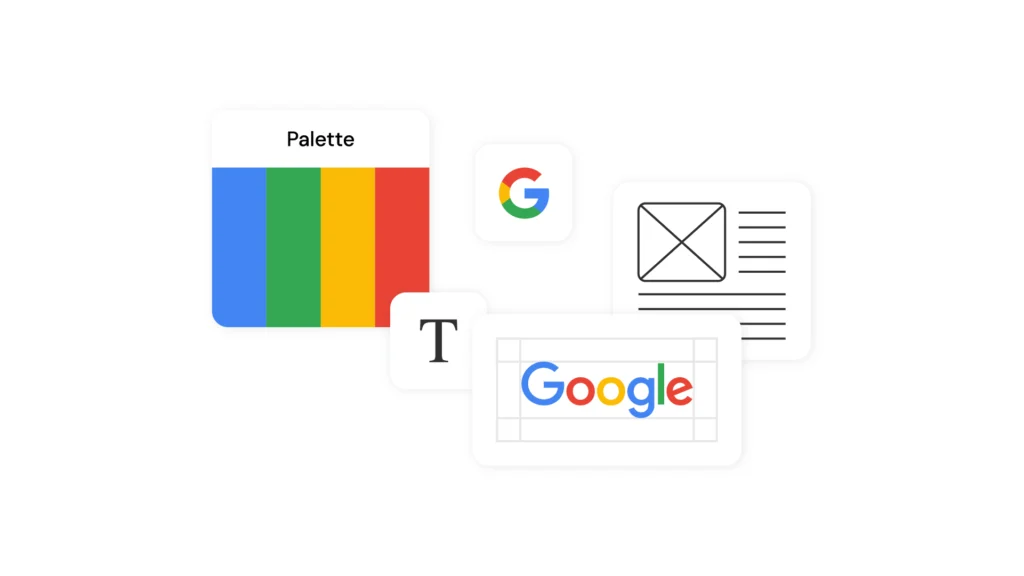
A complete visual identity comprises several fundamental elements :
- The main logo and its logo versions (horizontal, vertical, monochrome)
- The colour palette with precise colour codes (Pantone, CMYK, RGB, hexadecimal)
- Corporate typography (main and secondary fonts)
- Graphic elements characteristics (shapes, motifs, pictograms)
- The photographic style and iconography
- L’univers visuel global which reflects the brand's values
The psychological impact of visual identity
Visual identity plays a crucial role in how your brand is perceived. Neuromarketing research shows that the human brain processes visual information 60,000 times faster than text. Your visual identity must therefore communicate instantly:
- Your corporate values
- Your market positioning
- Your level of quality and professionalism
- Your brand personality
The graphic charter: the guide to applying your identity
Understanding the role of the graphic standards manual
The graphic charter, also known as brand guidelines or graphic standards manualis a technical document that codifies the use of your visual identity. If visual identity is your ‘what,’ then the graphic charter is your ‘how.’
The detailed content of a professional graphic charter
A brand book usually contains:
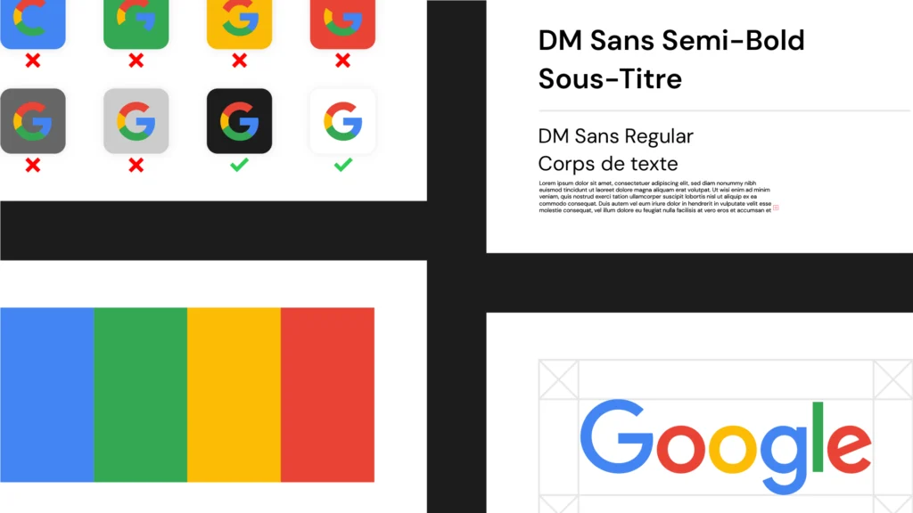
Logo standards :
- Permitted and prohibited versions
- Minimum sizes for use
- Protection and exclusion zones
- Rules for use on different media
Precise colour codes :
- Primary and secondary colours
- Variations for print and digital
- Permitted and prohibited combinations
Typographical rules :
- Font hierarchy
- Recommended sizes and spacing
- Uses according to communication media
Practical applications :
- Examples on stationery, website, social media
- Adaptations for different formats
- Guidelines for partners and service providers
The importance of a modern design system
With digitalisation, graphic charters are evolving towards design systems more dynamic. These systems include interactive components, animations and adaptation rules for digital interfaces. They enable perfect consistency across all of the brand's digital touchpoints.
The fundamental differences between visual identity and graphic charter
Nature and function of each
| Appearance | Visual identity | Graphic charter |
|---|---|---|
| Nature | Creative visual elements | Technical reference document |
| Function | Building recognition | Ensuring consistent application |
| Public | General public, customers | Internal teams, service providers |
| Evolution | Occasional complete overhaul | Regular updates |
Different creative processes
The creation of thevisual identity appeals to pure creativity :
- Conceptual research and brainstorming
- Graphical exploration and testing
- Creative concept validation
- Finalisation of visual elements
The development of graphic charter is more a matter of systematisation :
- Application requirements analysis
- Definition of rules of use
- Creation of concrete examples
- Detailed technical documentation
Temporality and evolution
Visual identity is generally designed to last for several years, while graphic guidelines require more frequent updates to adapt to new media and technologies.
How to create perfect consistency between the two
Step 1 : First, develop your brand identity
Before writing your logo guidelines, make sure your visual identity is perfectly defined:
- Audit of the existing situation : analyse your current communication
- Definition of brand territory : values, positioning, targets
- Creation of visual elements : logo, colours, fonts
- Tests and validations : check the impact on your audience
Step 2 : Structure your graphic standards
Once your visual identity has been finalised, develop a comprehensive graphic charter :
- Prioritise clarity : use simple language and visual examples
- Anticipate usage : consider all your future communication media
- Create templates : make it easier for your teams to apply
- Anticipate changes : your charter must be adaptable
Step 3 : Train and support your teams
Even the best graphic charter in the world is useless if it is not applied correctly :
- Organise training sessions for your teams
- Create practical tools (templates, automatic generators)
- Appoint brand guidelines representatives in each department.
- Set up a validation system before publication
Tools and resources for managing your identity
Several solutions can help you maintain consistency in your communication :
- Brand management platforms : Frontify, Brandfolder, Lucidpress
- Creative tools : Canva Pro, Adobe Creative Suite, Figma
- Storage solutions : shared drives with a clear directory structure
- Automated templates : PowerPoint, customised Google Slides
Common mistakes to avoid at all costs
Common conceptual confusions
Many companies make costly mistakes by confusing these concepts :
Mistake N°1 : create a graphic charter without a strong visual identity Consequence : inconsistencies and loss of brand recognition
Mistake n°2 : do not update the graphic charter Consequence : discrepancy with new digital media
Mistake n°3 : create an overly rigid charter Consequence : difficulties in adapting and stifled creativity
Practical application issues
- Insufficient training user teams
- Unsuitable tools for the application of the rules
- Faulty quality control pre-publication
- Obsolete versions circulating within the organisation
Solutions to avoid these pitfalls
To maximise the effectiveness of your visual system :
- Invest in training : your teams are your primary ambassadors
- Simplify the application : the more complex it is, the less it is respected
- Check regularly : audit your communications periodically
- Stay flexible : adapt to technological developments
Towards effective visual communication
The distinction between graphic charter vs visual identity is not just a question of vocabulary. It reflects two complementary approaches that are essential for building a strong and recognisable brand. Your visual identity creates emotion and recognition, while your graphic charter ensures the consistency and professionalism of your communications.
In a competitive environment where consumer attention is fragmented, maintaining perfect visual consistency becomes a decisive competitive advantage. Brands that invest in a a strong brand identity and well-defined graphic standards significantly increase their recognition rate and perceived value.
What's your next step ? Review your current communication strategy. Is your visual identity clearly defined ? Do your teams have an up-to-date and easily applicable graphic charter ? If the answer is no, it is time to take action.
Start today by defining your visual identity, then create the tools necessary for its consistent application. Your brand and your business results will thank you.